A couple interesting charts from Information Is Beautiful.
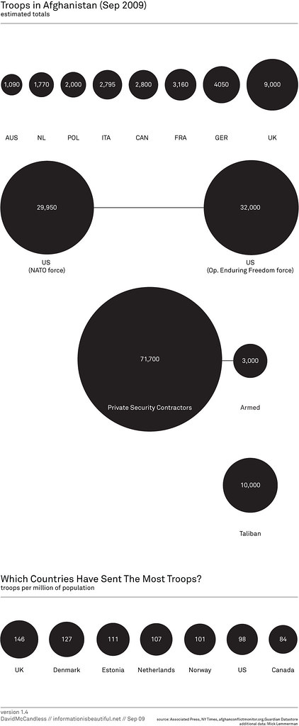
First, a chart of troop deployments in Afghanistan. The US has the most troops there, but I was surprised to see that on a per-capita basis, the US is #6 in the number of troops in Afghanistan.
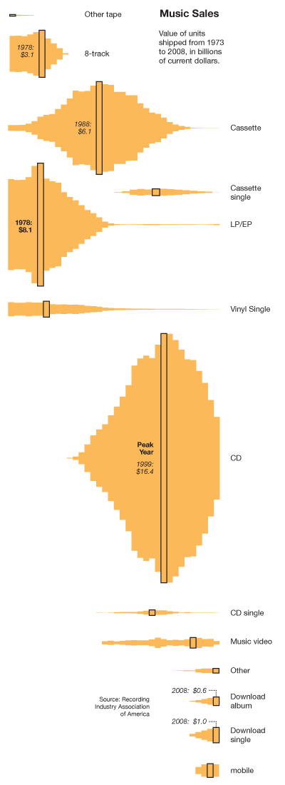
The second image is the revenue from music sales over the past 35 years. It’s split-out by format. Admittedly, I think this chart could be clearer. Interesting how CD sales peaked in 1999 at $16.4 billion/year, and it looks like it’s down to $5.4 billion/year in 2008. Meanwhile, online music sales are a scant $1.6 billion/year — far too small to make-up for the dropoff of CD sales. No wonder the music industry is going after filesharing. Wouldn’t you if you saw something a 50% drop in revenue in the last ten years – an amount equal to about $8 billion. That sounds like 8 billion reasons to go after filesharers.